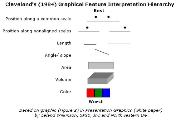
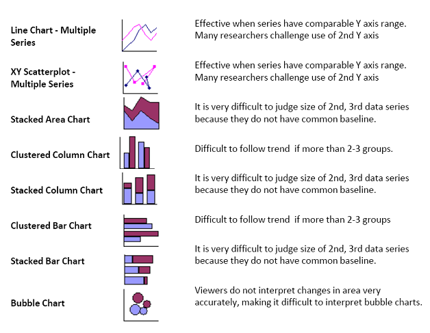
How to Select Visualisations
- Ask yourself:
Does this visualisation communicate information:
A. more clearly?
B. less clearly?
|
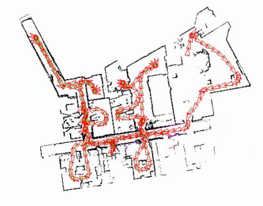
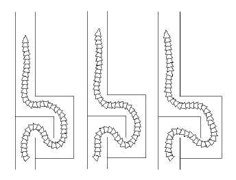
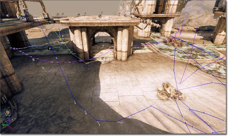
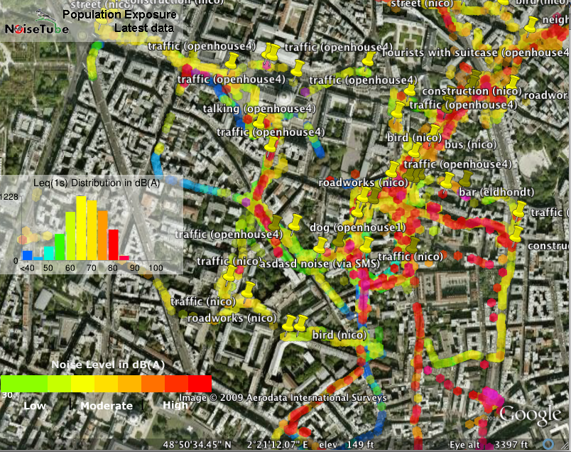
safe options
|
|
 |
|
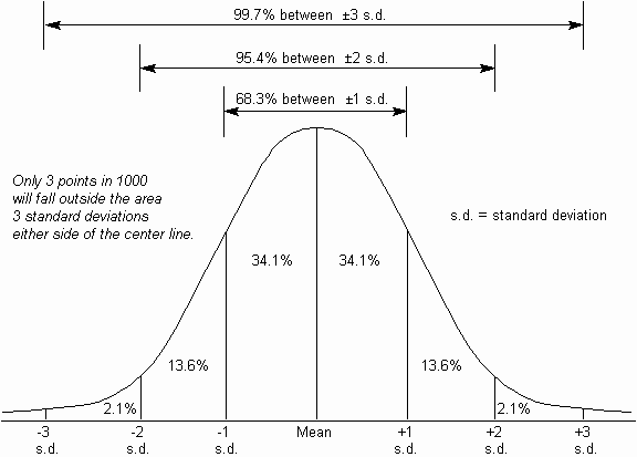 fig: normal distribution with standard deviations 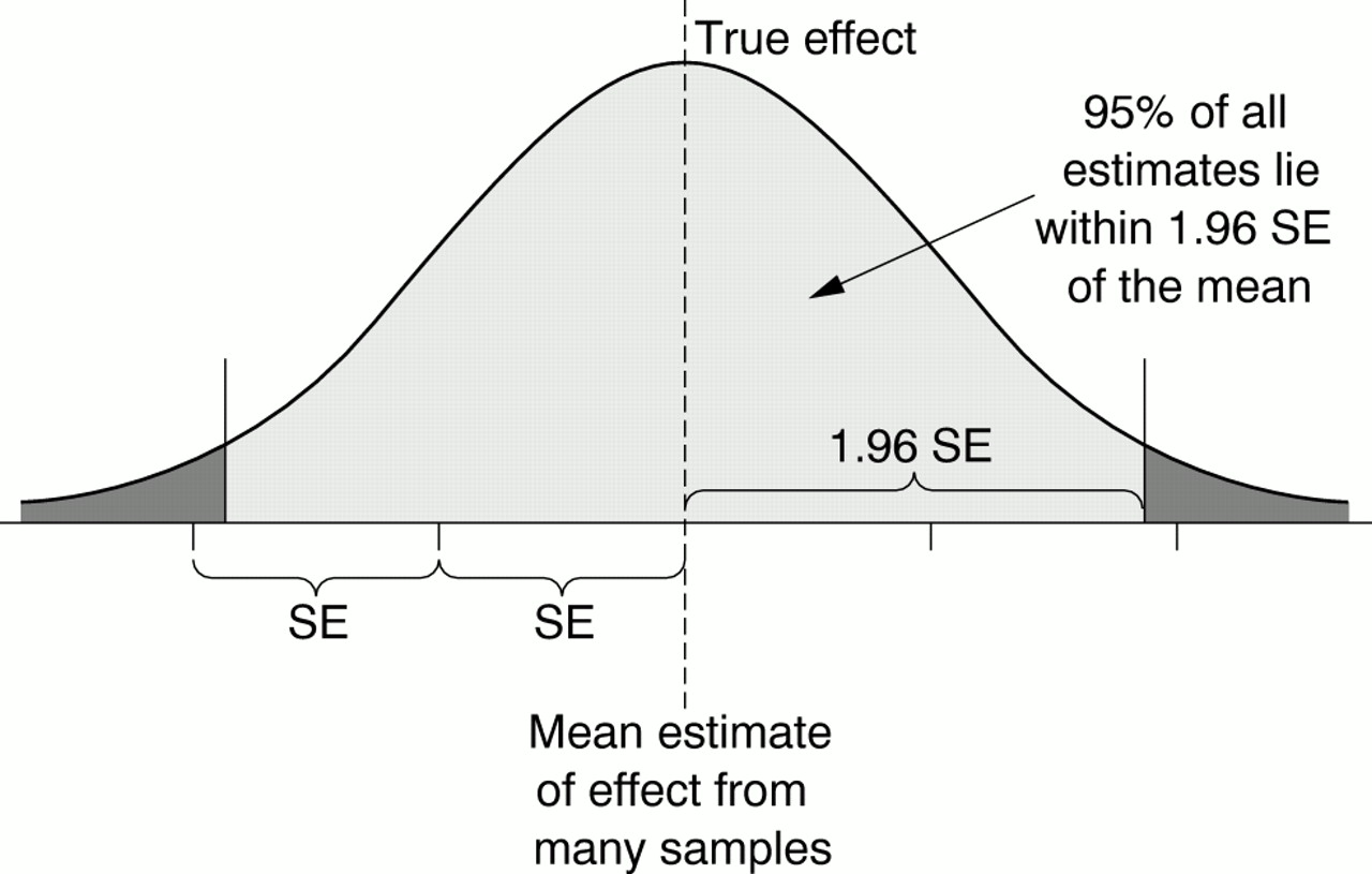 fig: normal distribution with standard error |
|
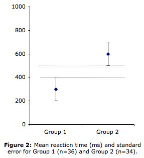
any closer and not significantly different |