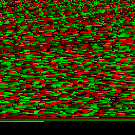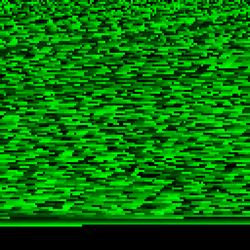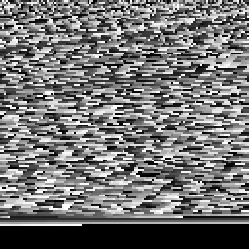
Argh my brain! The worst possible scenario for common colour-blindness.
My colleagues suggested a 2d visualisation in a lattice of coloured tiles, where the colour of a tile indicates its value. Red, green? They suggested. Anyone who was on-line last week has seen the issues relating to colour and perception! I initially visualised their experiment results with shades of green, and then mixes of green and red. I'm green-red colour-blind, so I could see straight away the problem with that. Even shades of a single colour is confusing. If you look at a mixed dark/light region, and then a mostly dark or mostly light region your relative judgment of colour change shifts. Different people perceive different colours differently. Mach banding pops out where colours or gradients change. Different displays have different colour 'temperatures' or profiles. Some are darker, some are blue-er or red-er. Does the browser gamma-correct the colour output or not? Displays do not have linear colour outputs. You can't use these visualisations in a sensible way.


A further issue is that there are only 255 shades of any particular colour on most image buffers. That's not enough shades - we won't to find clusters of like-values here. With a source document of 60,000+ segments, there is a huge range of quite separate segments that will have the exact same colour, and many more that are so close that your eye won't tell the difference!
I feel that these very obvious and easy-to-avoid problems are mindlessly repeated by analytics 'experts' (Google Analytics is a worst-offender in the realm of bad visualisations). But what's the best idea in this case, where we want to find grouped clusters of similar intensities or values? Perhaps a 1d configuration but with some sort of zoom is more reasonable. From Tufte et. al. we know that comparisons of line lengths in one dimension and direction is a more reliable perceptial guide than colour - perhaps a very long bar chart that also scales or zooms? Perhaps more aggregation or passes over the data are necessary to identify groups of values to be highlighted to the reader. Perhaps setting this against a symbolic document page will help visualise the position of the segment clusters in the whole corpus?